MB®
← Back to work Contact
Case study 01  ·  UX UI Re Design  ·  2025

Phenomena.

Redesign of the Phenomena Experience website to improve the user experience and align the interface with its identity.
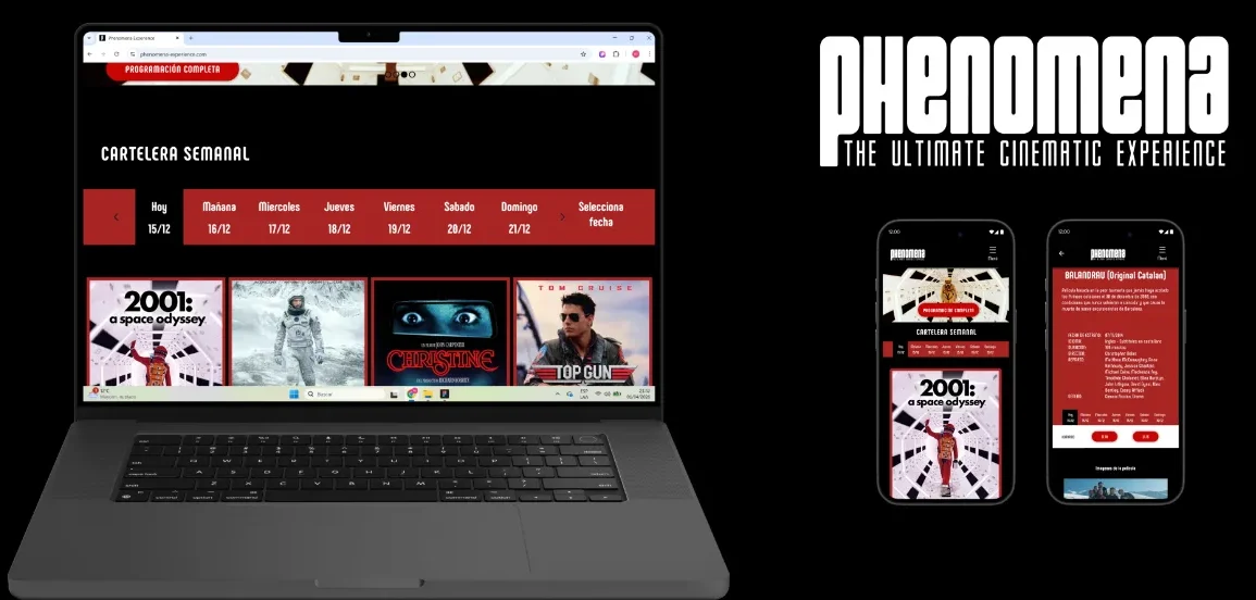
Desktop prototype ↗ Mobile prototype ↗
Role
UX / UI Designer
Scope
Website redesign
Output
IA, UI, Prototype
Year
2025
Phenomena redesign cover
02 / Problem

Four issues made the site hard to use.

Proposal
Prioritization of key content, clear visual hierarchy, reduced friction, and adaptation to mobile context.
Before — click to enlarge
Old site — home & film page
01
Lack of information hierarchy
02
Difficult to scan the movie schedule
03
Outdated visual design
04
Mobile experience can be improved
Phenomena screen
{{ caption }} — click anywhere to close
03 / Design Concept

Cinema as an event.

The idea of “cinema as an event” is introduced as a concept to guide visual and interaction decisions throughout the design.

04 / Architecture

The website is reorganized by prioritizing the movie schedule and simplifying navigation to improve access to films, showtimes, and the ticket purchase flow.
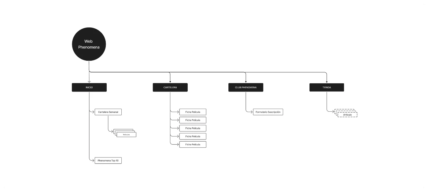
Phenomena information architecture
Sitemap — four top-level sections
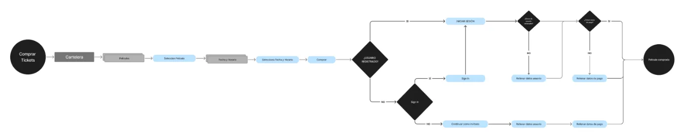
Ticket purchase user flow
User flow — buying tickets, registered or as a guest
05 / Visual Design

The interface uses a typography aligned with a cinema style.

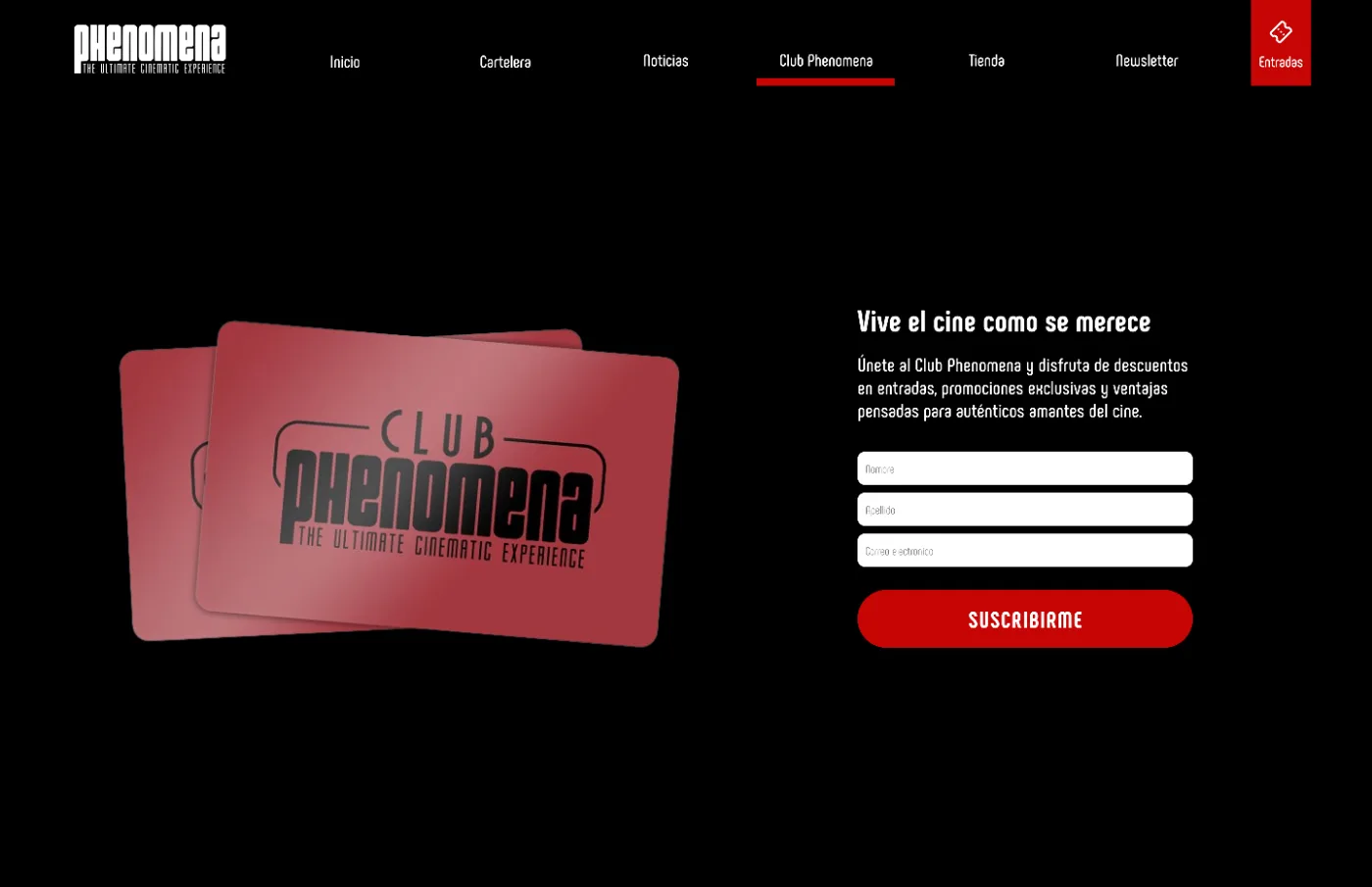
The design creates a feeling of being inside a movie theater, with a black background and red tones in buttons and components, inspired by classic carpets and seats.

Typography
Regular / Bold
Phenomena typeface — Aa
Family
Phenomena
ABCDEFGHIJKLMNOPQRSTUVWXYZ
abcdefghijklmnopqrstuvwxyz
1234567890
#000000
Cinema red
#FFFFFF
Surface
Club Phenomena page
Club Phenomena
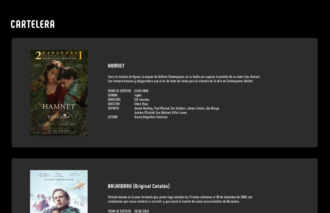
Cartelera page
Full listing
New home page

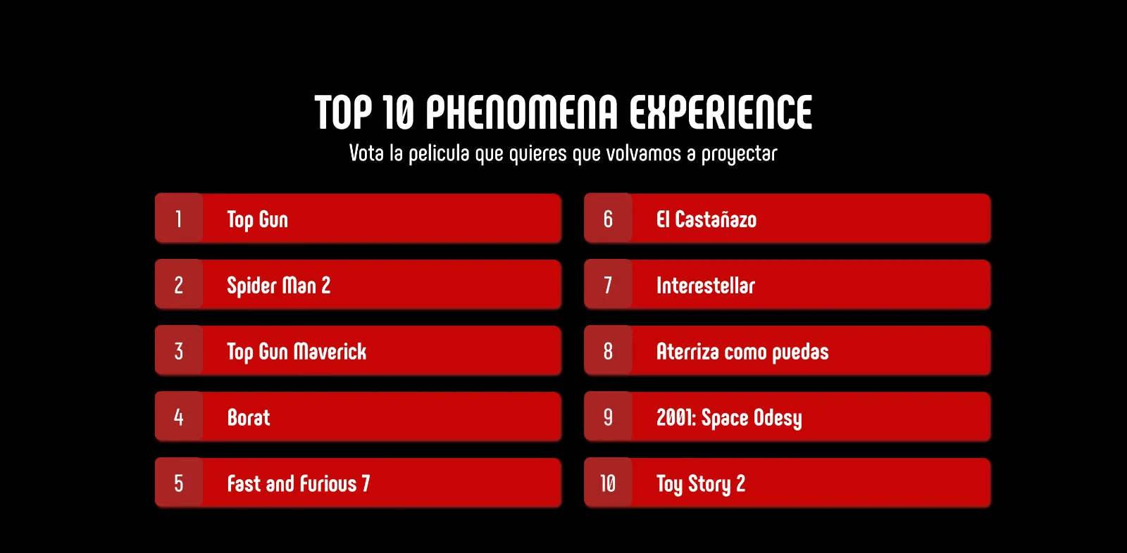
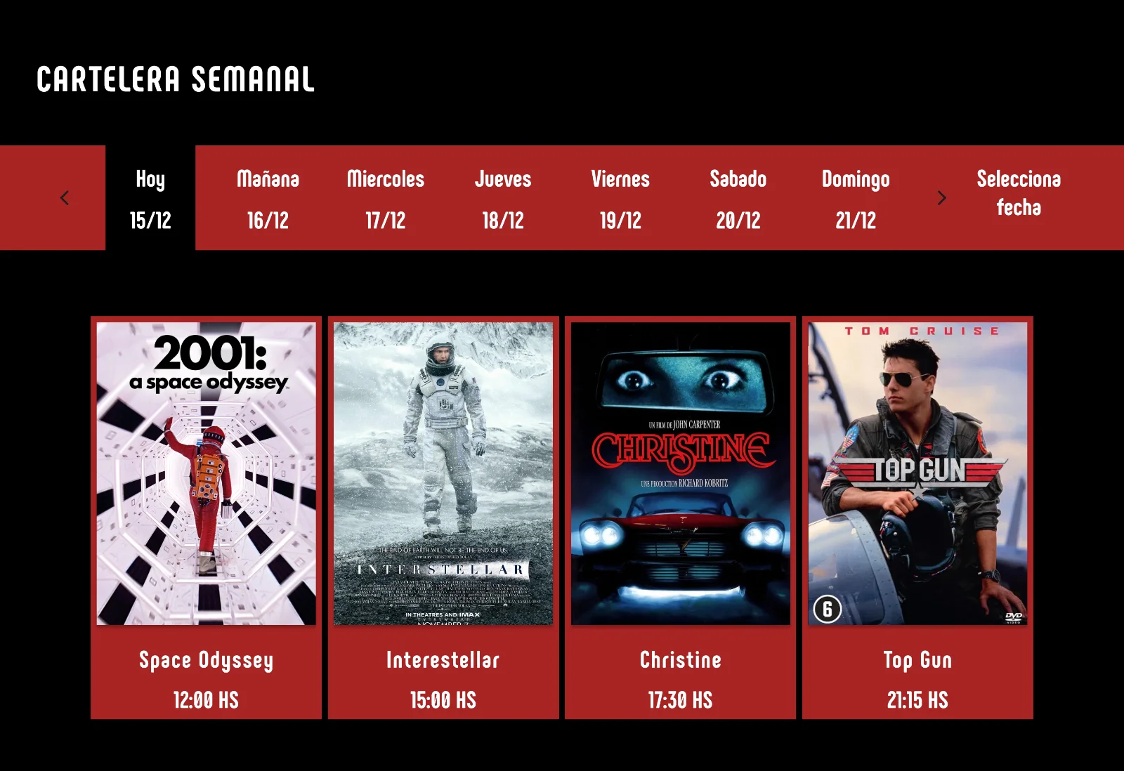
Three blocks on a single page: a full-bleed film hero, the weekly schedule with a day selector, and the Top 10 vote.
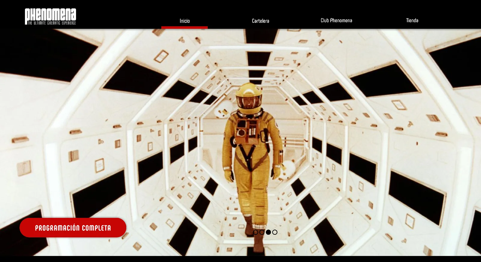
Phenomena home hero
Hero — film of the week, direct to full schedule
Weekly schedule
Weekly schedule
Top 10 vote
Top 10 — audience vote
06 / Purchase Flow

Fewer steps between the film and the seat.

Special focus was placed on the ticket purchase flow to reduce friction and make the process faster and more intuitive. The goal is to help users complete their purchase with fewer steps, improving overall conversion.
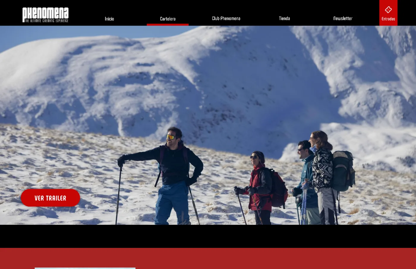
Home with weekly schedule
Step 01
Home with the weekly schedule
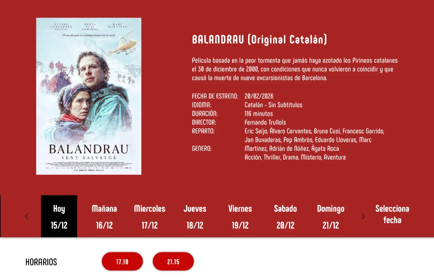
Film page with trailer
Step 02
Film page, trailer as entry point
Film page with showtimes
Step 03
Showtimes for the selected day
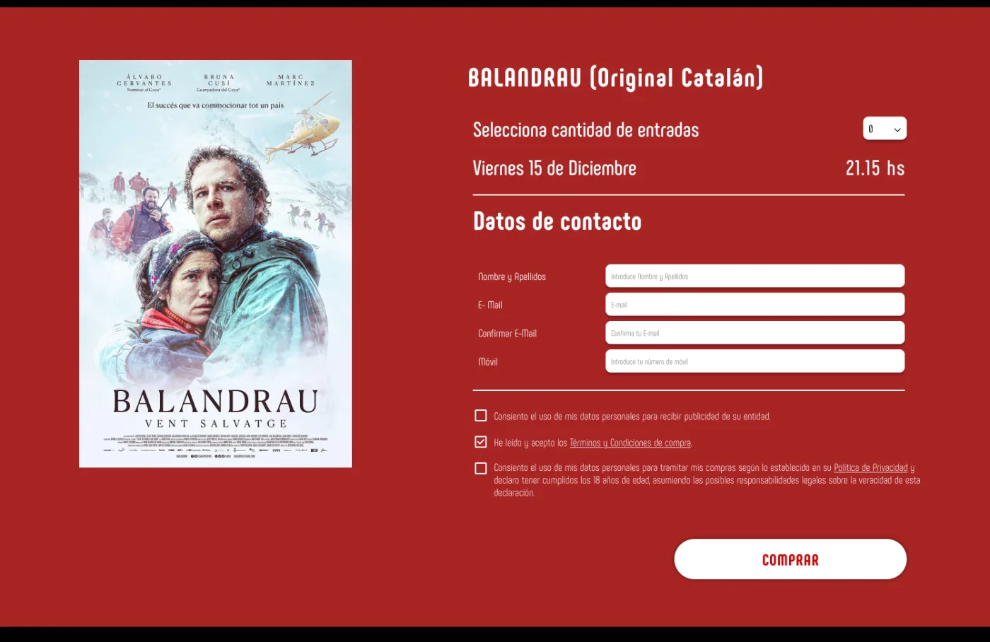
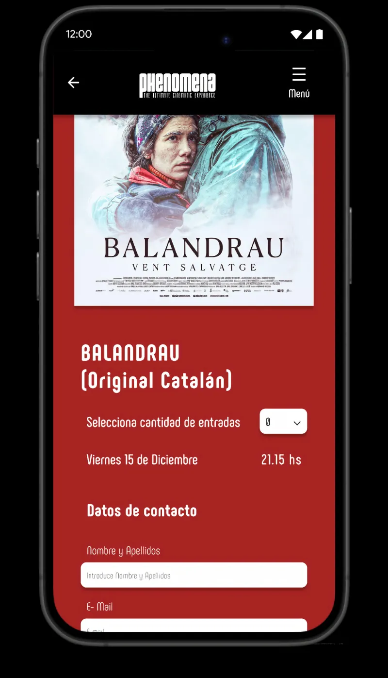
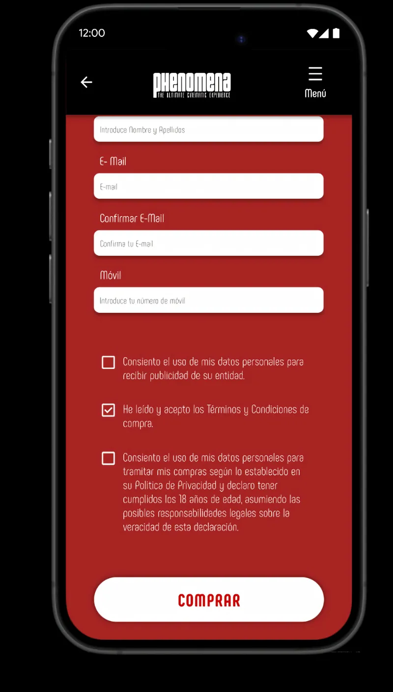
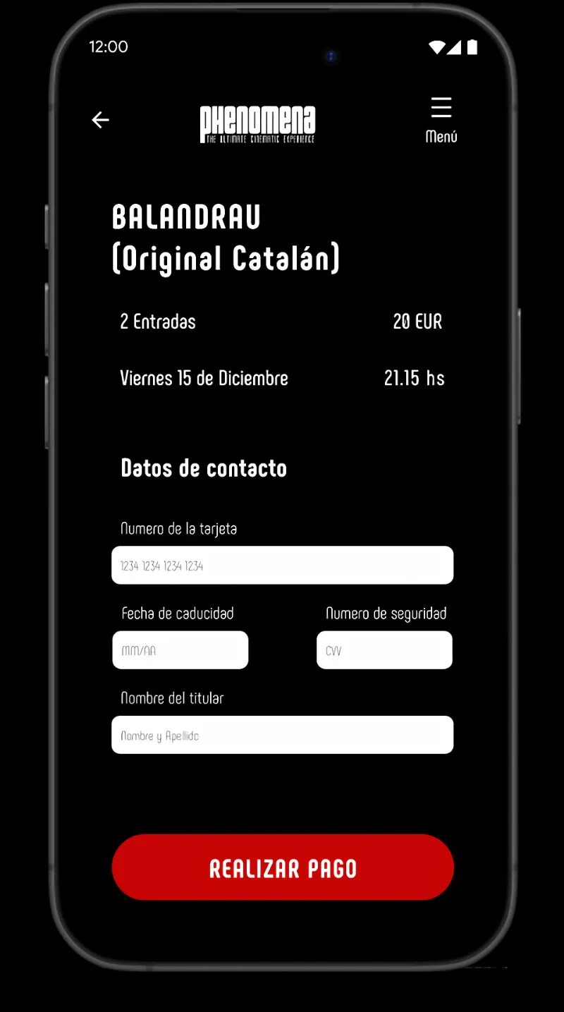
Tickets and contact details
Step 04
Tickets and details in one screen
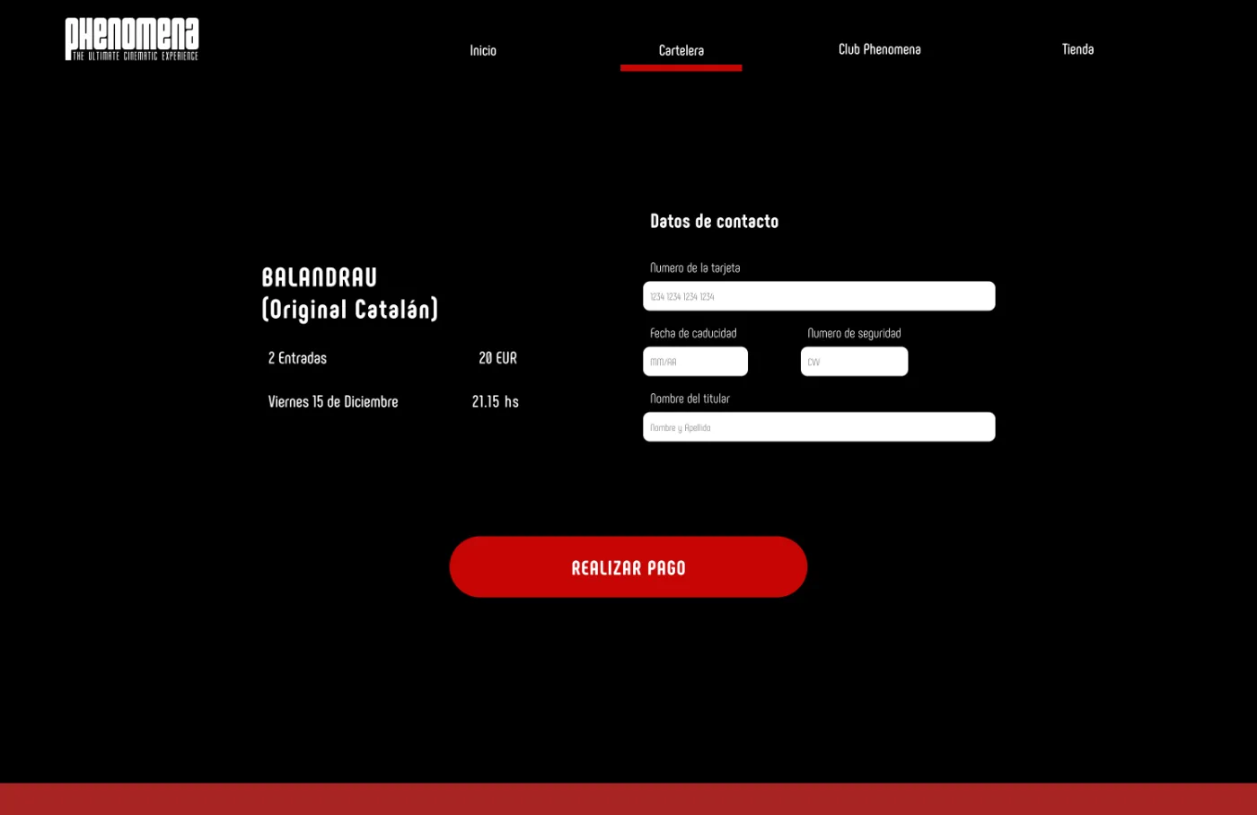
Payment
Step 05
Payment
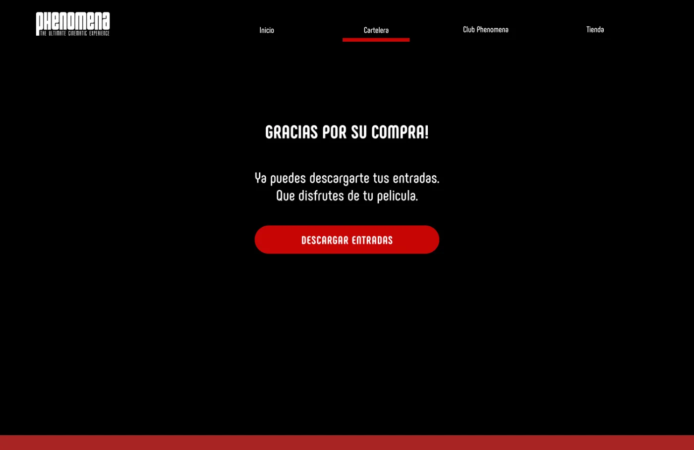
Purchase completed
Step 06
Tickets ready to download
07 / Mobile

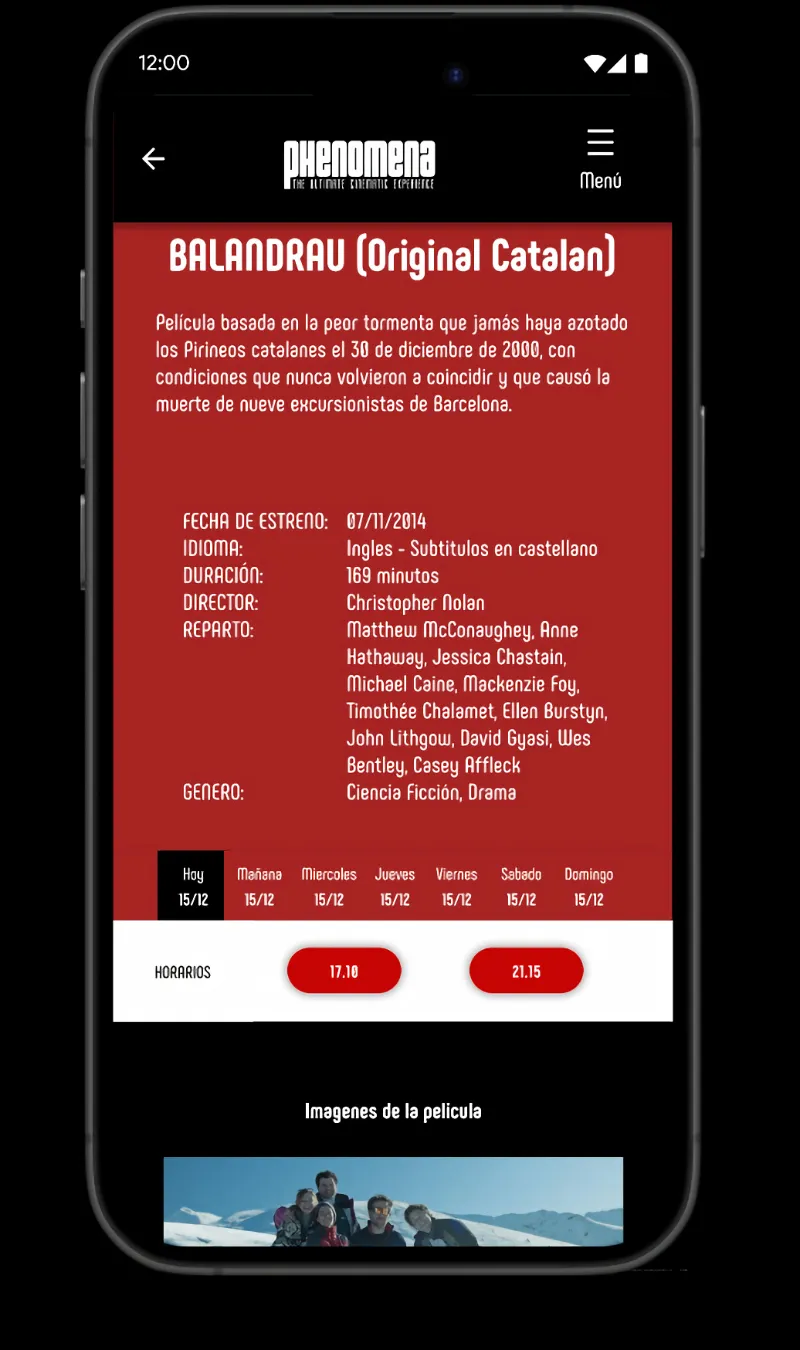
The design is adapted for mobile, focusing on quick access to key content and clear navigation. The interface prioritizes the movie schedule and main actions, allowing users to find information and buy tickets easily on smaller screens.
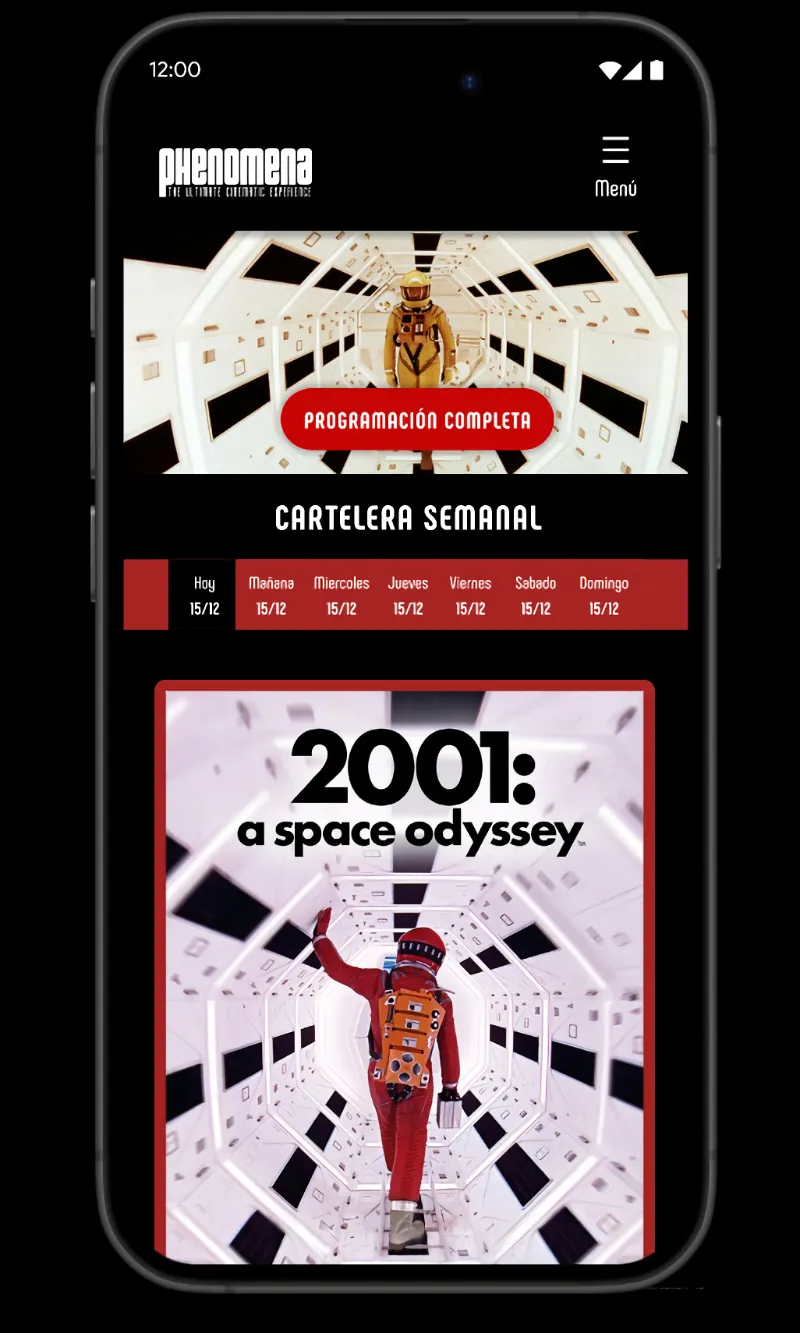
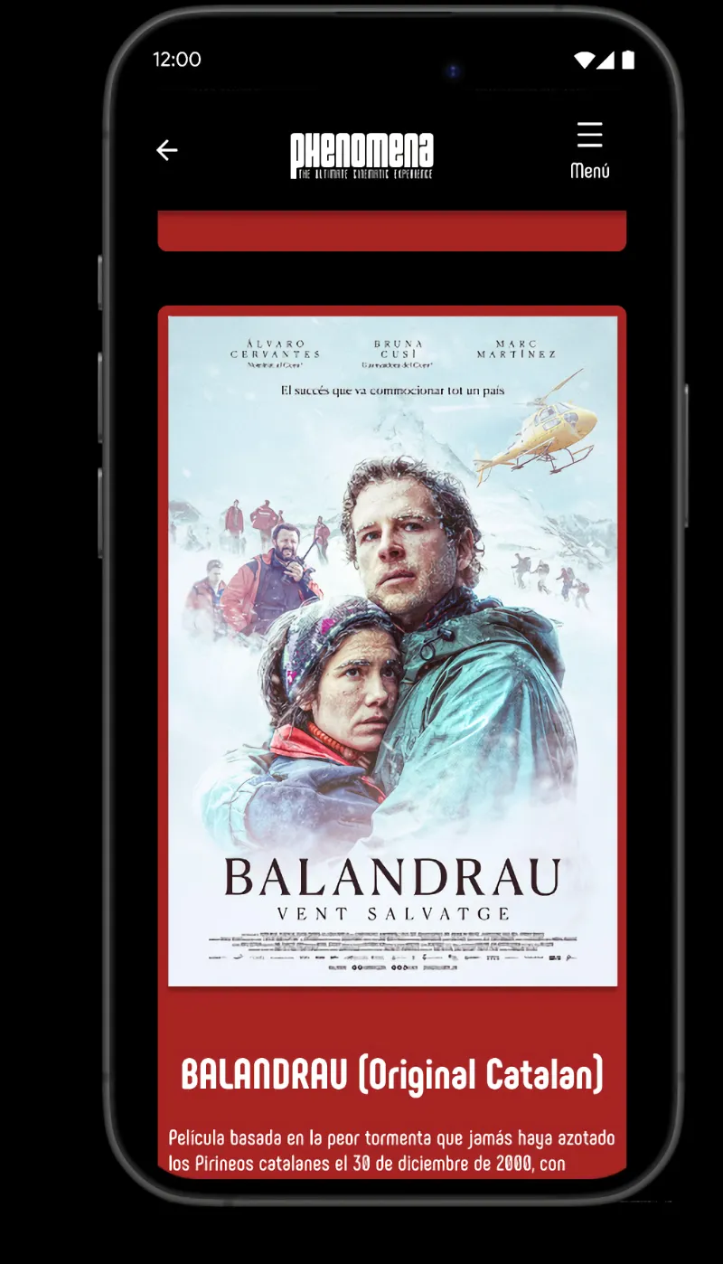
Mobile home Mobile film page Mobile film detail Mobile ticket selection Mobile payment Mobile purchase completed
Responsive from 1440 to 390px
08 / Prototype

Both versions are navigable end to end, from the weekly schedule to the ticket confirmation.

09 / Next Project
Art X All
View case study →
marianoberraz93@gmail.com
Mariano Berraz ® — Barcelona